Hello You’re Welcome
BRANDING
Overview
Hello You're Welcome is a specialty café and donut shop built around gourmet donuts, including vegan and gluten-free options, with an emphasis on care, craft, and radical inclusivity. The brief called for a complete visual identity system: one that could celebrate the donut as the hero product while naturally extending into coffee and tea, and establish the café as a beloved neighborhood destination that feels joyful, artisanal, and unmistakably human.
The scope spanned brand strategy, logo development, a comprehensive brand guide, packaging, merchandise, web, print, and social, resulting in a cohesive system built to scale from a paper bag to a storefront window.

Approach
The design strategy began with a clear creative platform: risograph printing as both aesthetic and philosophy. Riso's hands-on, ink-layered process mirrors the bakery's own small-batch values, making it a conceptually grounded choice rather than a purely stylistic one.
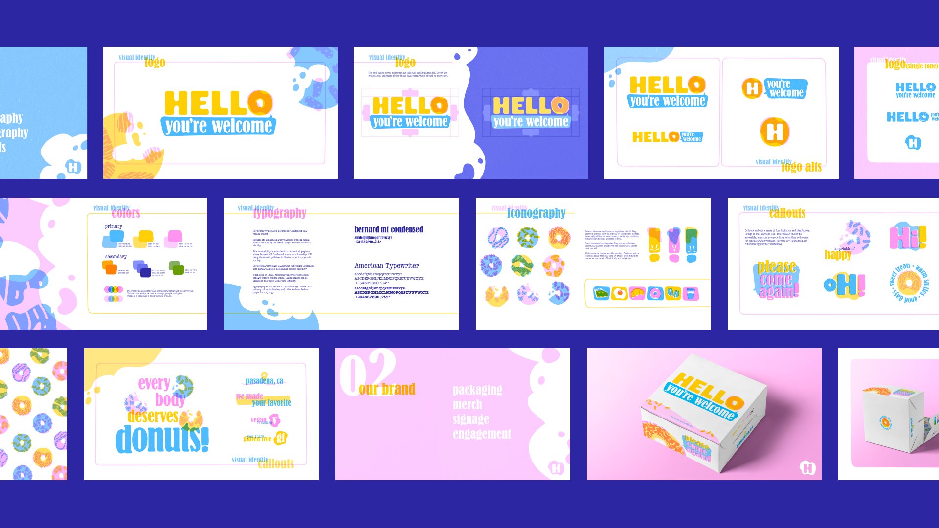
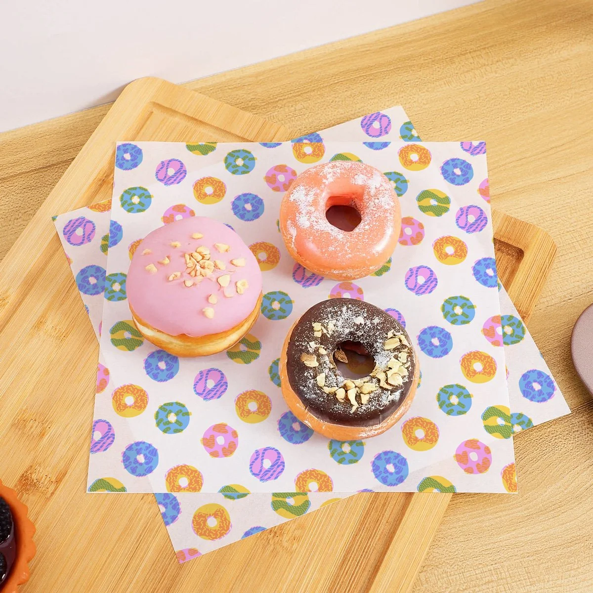
From that foundation, a structured color system was built around three primary spot colors engineered to generate secondary hues. This constraint-led approach ensures visual consistency across every application while retaining the warmth, texture, and subtle imperfection that give the brand its character. The overlapping hues form an almost-complete spectrum, quietly reinforcing the shop's inclusive values at the system level.
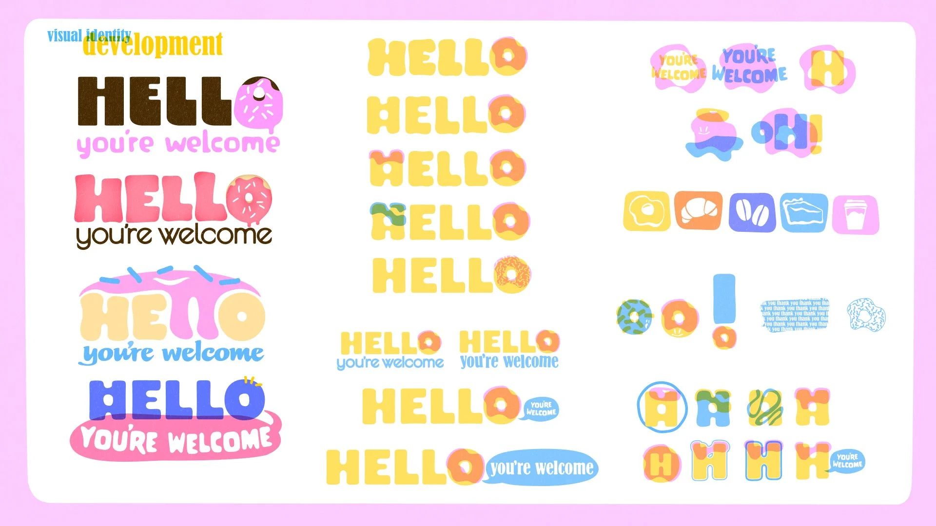
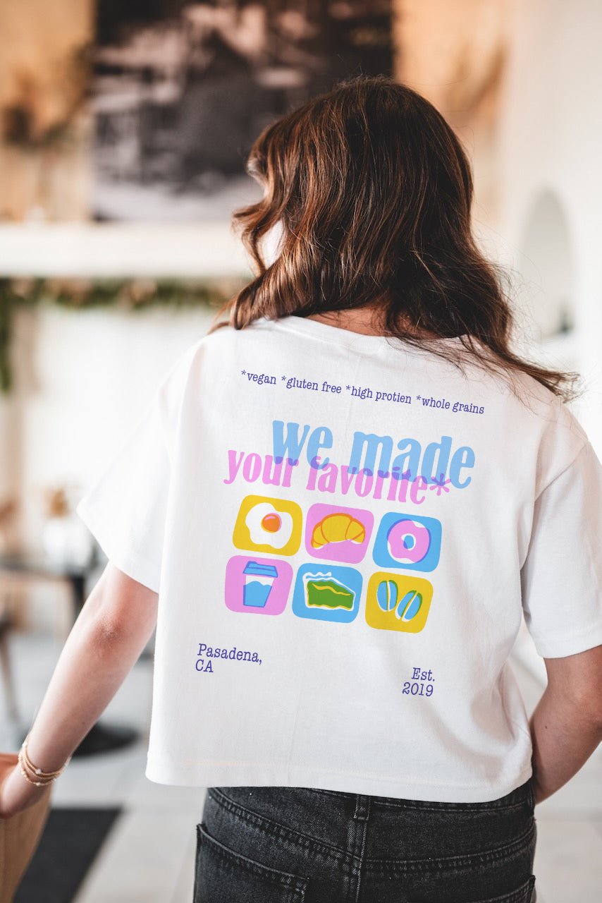
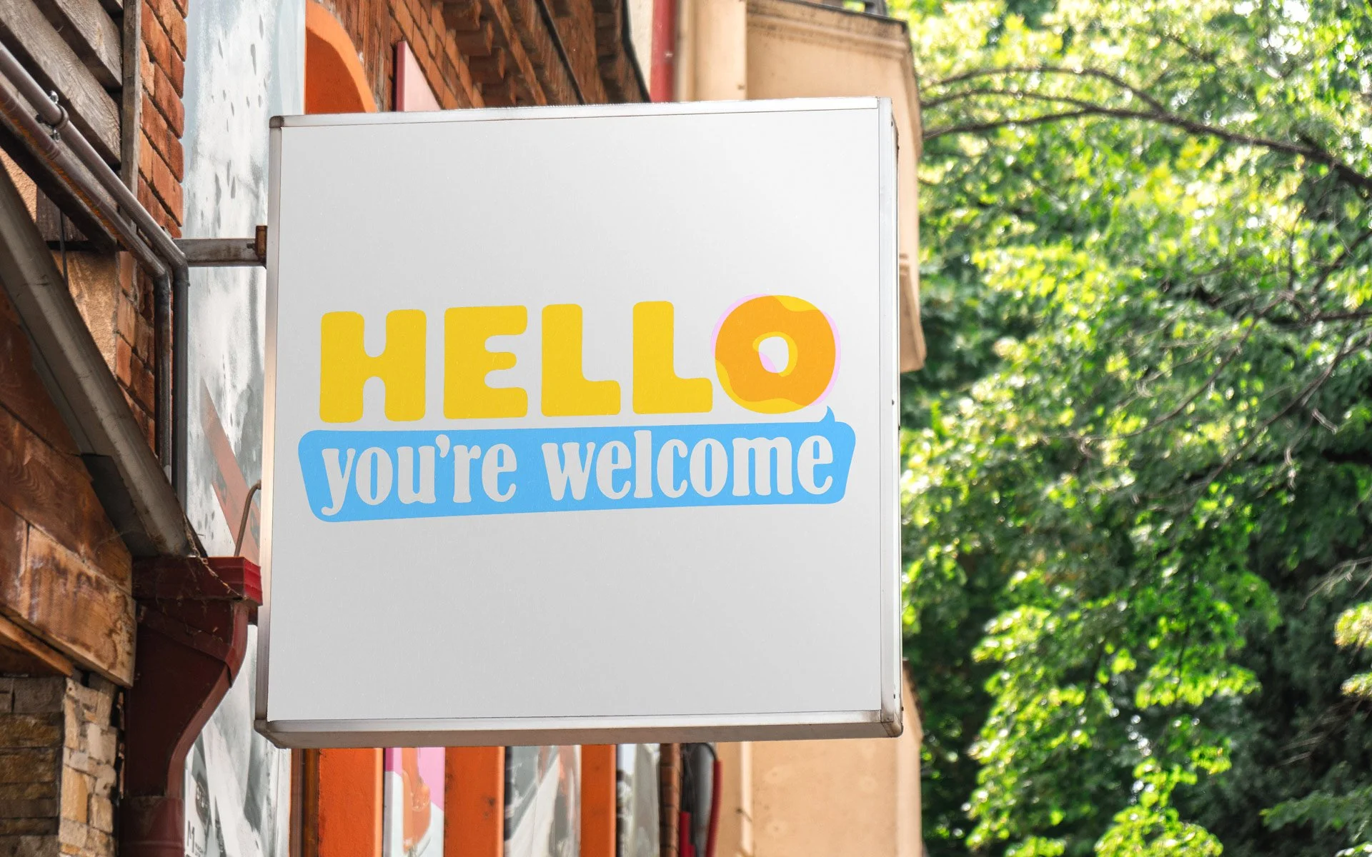
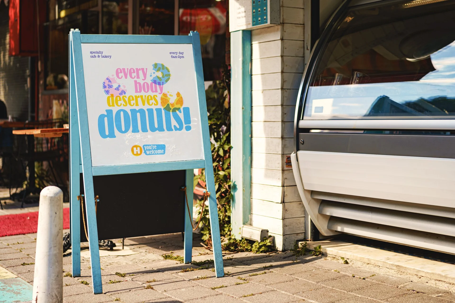
Every brand element, the flexible logo suite, friendly iconography, donut-driven patterns, and original character illustrations, was designed with scalability in mind: modular enough to adapt across touchpoints, distinctive enough to be immediately recognizable. The result is a brand language that feels considered and intentional at every scale.
Challenge
The central challenge was translating a handmade, inclusive and joyful brand ethos into a visual system flexible enough to live across touch points without feeling corporate or overproduced.
The shop's identity as a specialty café and a gourmet donut destination required a hierarchy that celebrated the donut as hero while making room for coffee and tea to coexist naturally. Designing for vegan and gluten-free offerings added another layer: the brand needed to signal openness and welcome without leaning on the restrictive language that so often accompanies dietary-focused food businesses. The feeling had to be abundance, not compromise.
Technically, the risograph aesthetic presented its own constraints. True riso printing achieves its signature layered color through a limited, fixed ink set. Recreating that spirit digitally meant building a color system based on primary spot colors that generate secondary hues. Every element, patterns, icons, typography pairings, had to honor that logic to feel cohesive and intentional rather than decoratively retro.
Results
The final identity system is expansive without being inconsistent. A flexible logo suite gives the brand room to breathe across every surface. A full brand guide codifies the color logic, type hierarchy, iconography style, and pattern library so the system can scale.
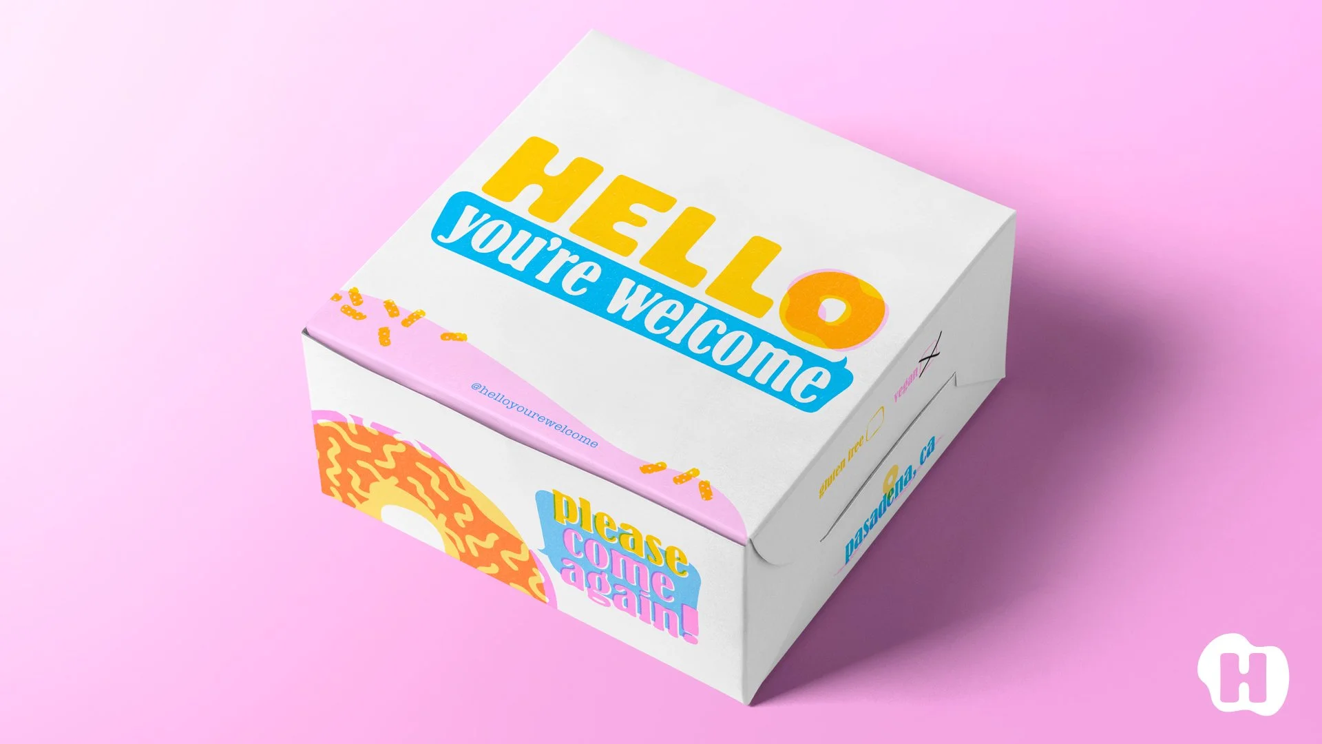
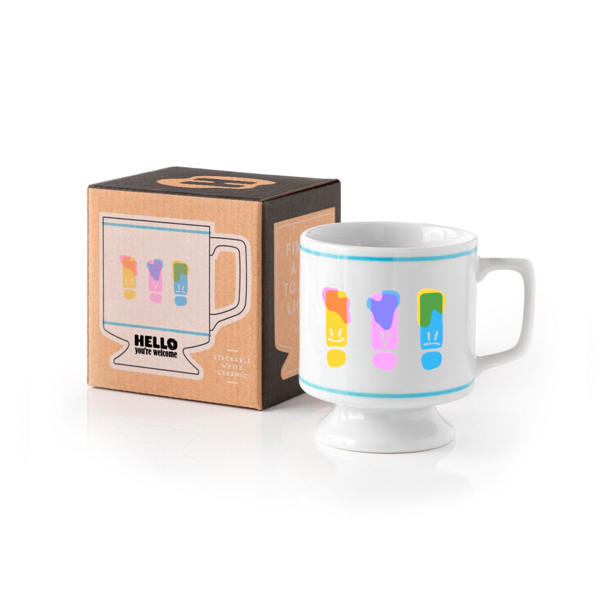
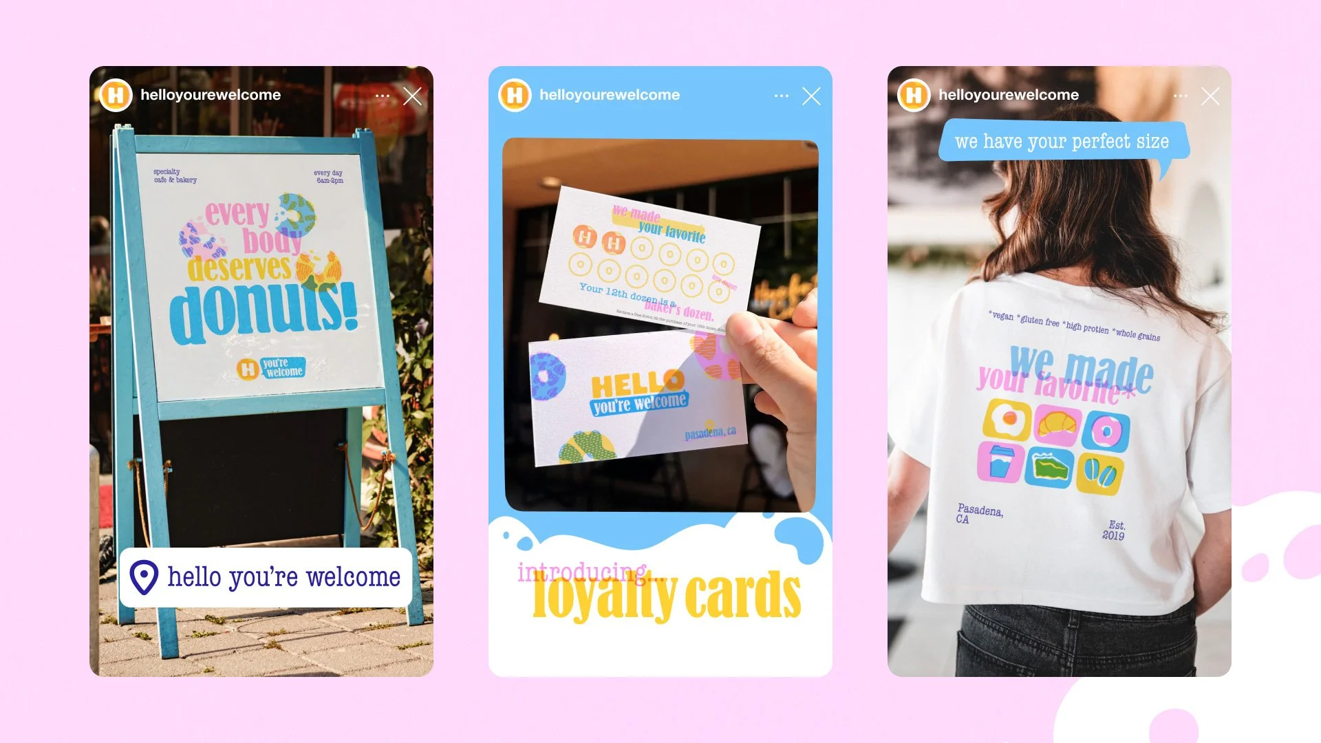
Across packaging, merchandise, print, and digital touchpoints, the brand reads as warm and handcrafted but never precious. Copywriting woven throughout the identity grounds the visual language in a voice that's generous and specific.
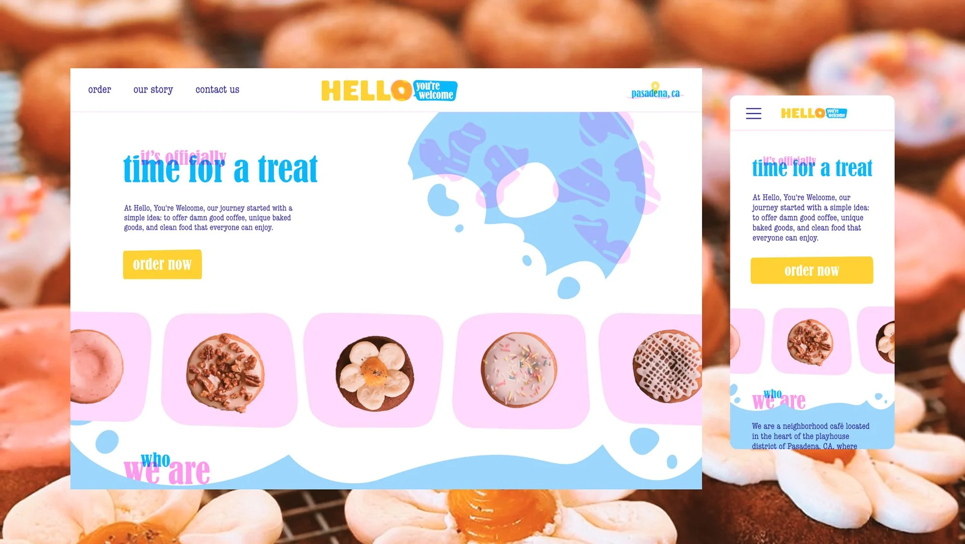
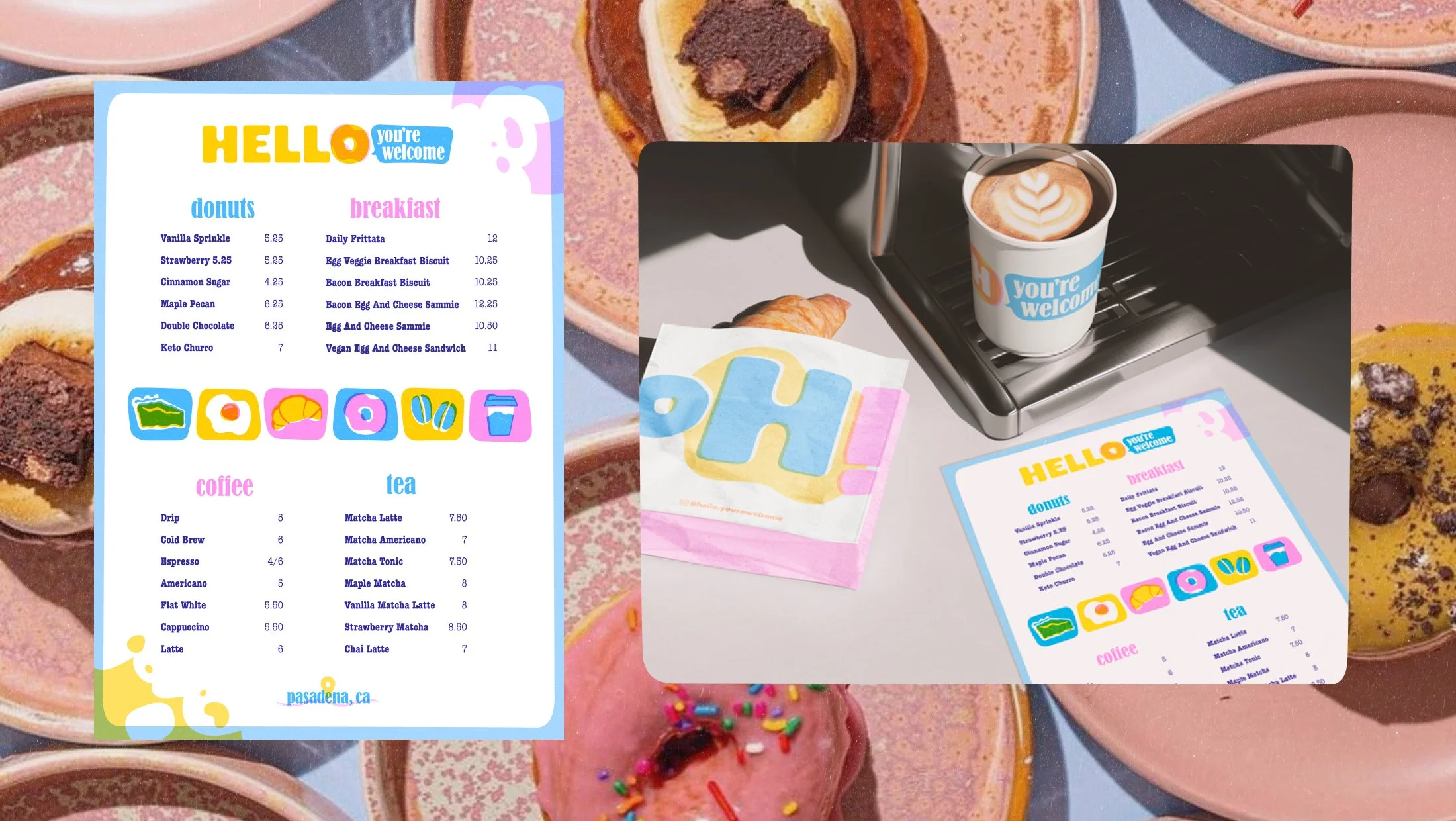
The website homepage, menu design, and social templates demonstrate how a brand this textural and illustrative can translate cleanly to digital formats without losing character. The result is an identity that feels lived-in from day one: the kind of place you'd walk past and immediately want to go inside.